The Boring Web
Sean (Grade 11 / Northfield School of Arts and Technology) Posted February 25 2007Editor’s note: This article was originally written for Sean’s tech-oriented weblog, Redirect. Sean has served as Charter Vision’s chief editor since 2005 and as a general volunteer since 2003.
The internet isn’t all that interesting. At least not visually. This thought strikes me every now and again when I’m flipping through a magazine. Large, gripping pictures; varying font faces and sizes; and intriguing graphics — these are all things you expect to see in print but seldom find online.
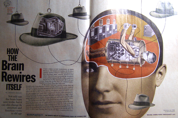
Take, for example, this article — How the Brain Rewires Itself — from the January 29 issue of Time Magazine.
Now, look at its online companion:
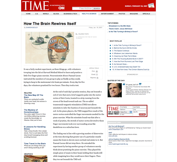
There’s a lot of information being displayed in the online version, some of it very aesthetically interesting, but most of it of little relation to the article (though I mustn’t speak ill of an article linked on the page, entitled “Is the tide turning in Britney’s favor?” — after 85 years, Time is finally living up to its potential).
The online issue also has the very same graphic seen in the print one. And at a whopping 360×265 pixels. Take technical hangups out of the equation for a second: Why is the image so small? Why isn’t the text integrated with it? Why is the biggest visual point of this page the Time masthead and not the article itself?
Especially that last question. Even as I’m looking at my own blog, the header for the site name stands out significantly more than the title of the entry. I would imagine all this goes back to thinking the basic structure of a web page (esp. XHTML tags [XHTML is the language used to mark up websites] <h1>, <h2>, etc.). And I suppose in 1996, that was a good excuse, but we don’t have that limitation anymore: we can easily manipulate the final seen product without altering the information-providing XHTML.
And don’t be afraid to bend the rules a little bit. Standards advocates are constantly fretting about the 3% (that’s a gross and likely inaccurate estimation) who use text browser or screen readers, that we tend to neglect the vast majority whose browser use CSS and Javascript and other things we can use to enhance our sites. I’m not saying web developers should go Frontpage on their users [“Frontpage” is the name of now-discontinued software from Microsoft, widely criticized for its poor cross-browser compatibility], but let’s not forget the 97%.
Two websites that are the most visually impressive to me: Gucci and FRONTLINE. Gucci deserves applause as well for doing incredible effects without resorting to Flash (yeah, I did just kind of contradict my last paragraph, but I really really hate Flash [Adobe Flash is a browser plugin used by many sites to provide visual effects and audio/video. It’s looked down upon by some web developers because the content is not accessible to those who do not have the correct plugin.]). And FRONTLINE does exactly what I wanted to see from magazines like Time: the graphics are large and eye-catching without distracting from the content. And the features clearly take precedent over the fact that it’s from FRONTLINE or PBS.
I recently completed an extremely simple-looking redesign of Charter Vision — in fact I generally pride myself on my simple designs — I guess I justify it because A. the layout of Charter Vision’s print issue was relatively straight-forward too and B. there would be too much work involved to create a unique design for each story, but then again, B is everyone’s excuse…